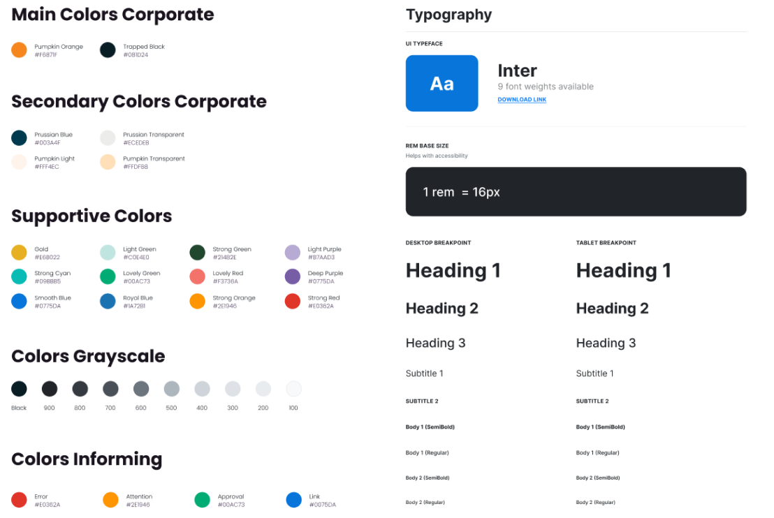
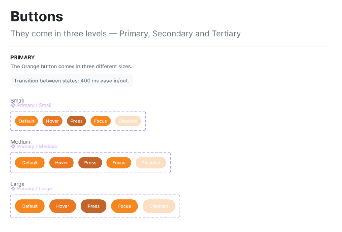
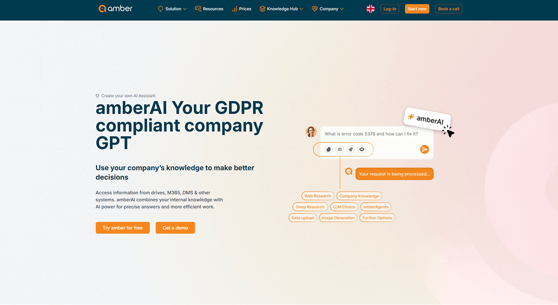
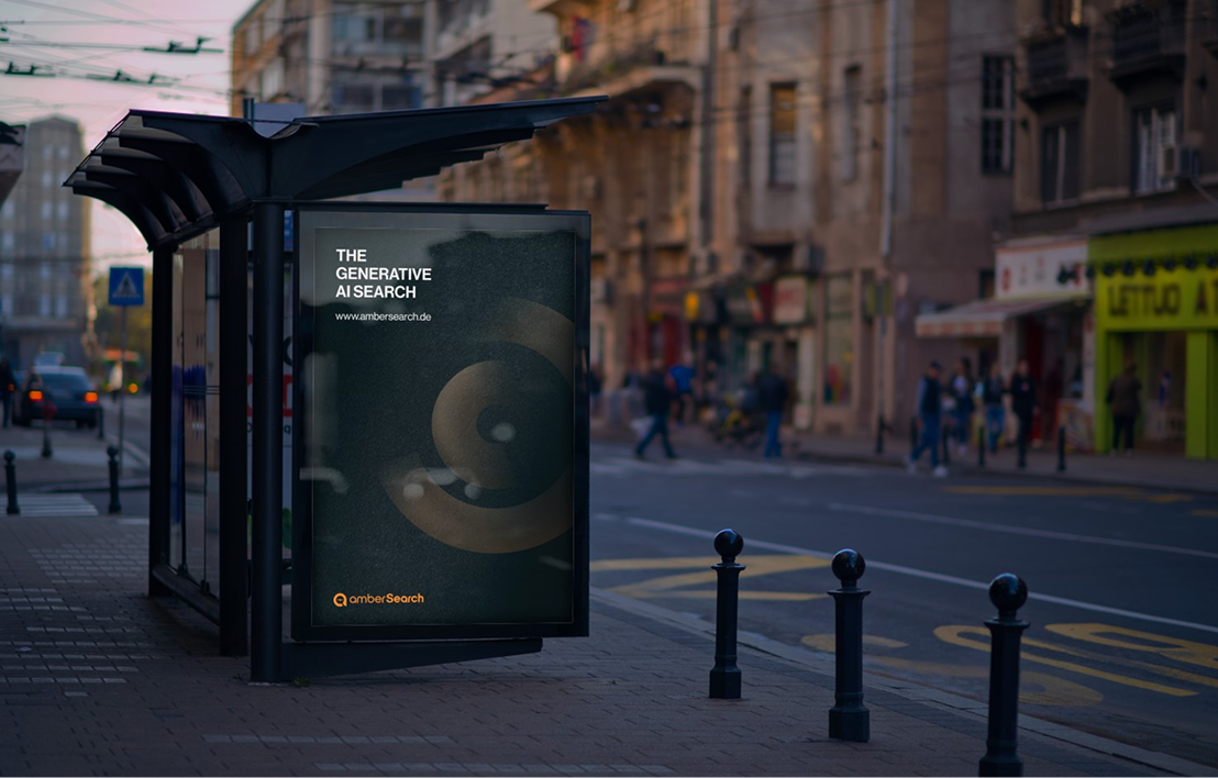
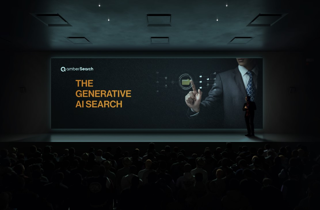
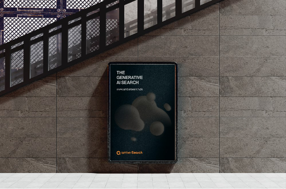
I treated the website not as a standalone project, but as one layer of a brand-wide UI system. Every decision – from colors to buttons to spacing – had to work on the website, inside the app, and in print materials for visual consistency.
1. Research-first:
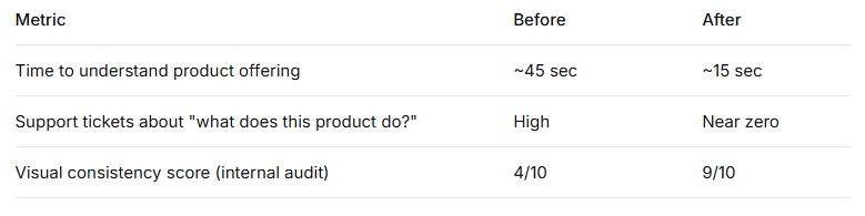
This research revealed that users struggled to understand which product did what. The website needed to add value by clarifying different approaches for different products – not just listing features.
2. Structured composition for clarity:
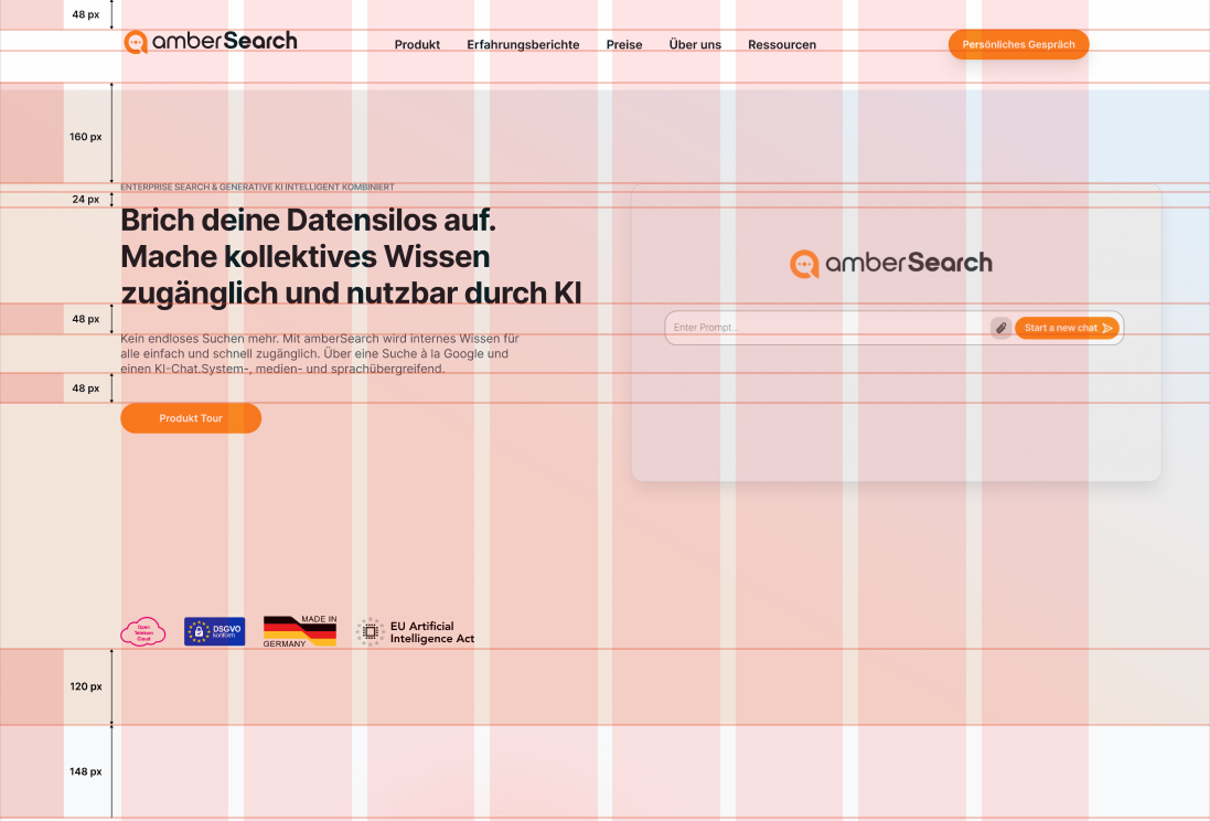
The old layout was visually flat. I redesigned the information architecture around a clearer, hierarchy-driven structure:
- Hero section → One clear value proposition (“The Business AI that delivers the right answer at the right time”)
- Trust indicators → ISO-27001, GDPR, EU AI Act compliance (front and center)
- Distinct product zones → Each product gets its own visual territory
The result: users can scan, understand, and act – without reading paragraphs.
3. A unified UI library (website + app + beyond):
This was the biggest strategic decision. I defined a single design system that spans:
- Website
- App interface
- Presentations
- Marketing materials
Some components were redesigned from scratch to ensure the same logic applied everywhere. A button on the website behaves and looks like a button in the app. A color means the same thing across mediums.