
SaaS Restaurant
Client
Confidential
Year
2024
MEDIUM
DIGITAL
Category
UI/UX SAAS/CRM
Restaurant SaaS & CRM Dashboard UX/UI case study – centered on product design, data density, and restaurant-specific workflows.
THE CHALLENGE
Restaurant operators don’t have time. They’re managing orders, inventory, staff, and customers – often from a phone or a point-of-sale terminal between rushes. The existing dashboard was functional but fragmented:
- Key metrics buried behind multiple clicks
- No clear relationship between sales data, inventory, and customer info
- Visual noise made quick scanning impossible
- Different user roles (owner, manager, cashier) needed different views, but one dashboard tried to serve all
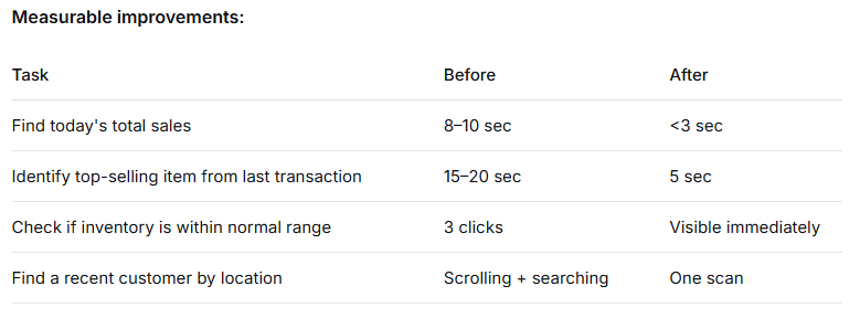
- The goal: design a dashboard that restaurant staff can read in 3 seconds and act on in 10 seconds – without training.
My Approach
I focused on three principles: hierarchy, density with clarity, and role-agnostic layout.
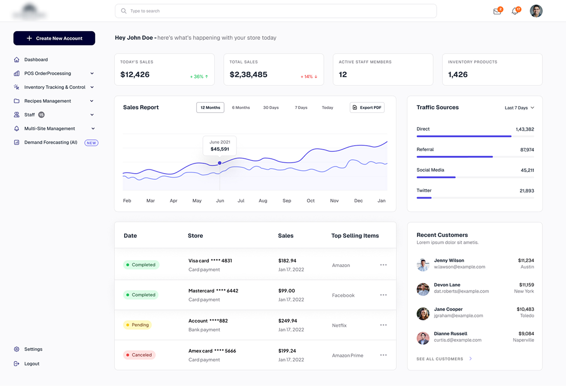
1. Personal greeting & immediate context
2. Left navigation as command center
The sidebar organizes the restaurant’s core workflows:
- POS / Order Processing
- Inventory Tracking & Control
- Recipes Management
- Staff
- Multi-Site Management
- Demand Forecasting (AI)
Design decision: Priority order follows frequency of use, not alphabet or whimsy. POS and Inventory come first because that’s where restaurant staff live.
3. KPI row: Four numbers, zero clutter
Top metrics are isolated as large-format cards:
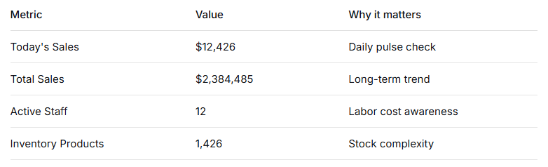
Design decision: No icons, no descriptions, no secondary text. Restaurant staff know what these numbers mean – they just need to see them fast.
4. Chart + table: Two views of the same story
Chart (Sales over time):
- 12-month view (Feb–Jan)
- Clean Y-axis scaling (0–100)
- Single legend (Blue/Green/Red for different revenue streams)
Table (Recent transactions):
- Date | Store | Sales | Top Selling Items
- Status badges (Completed / Pending / Cancelled)
- Payment method inline (no extra column)
Design decision: The chart shows trends. The table shows specifics. Neither repeats the other – they work as a pair.
5. Traffic sources + recent customers: The CRM layer
Left column (Traffic Sources):
- Direct, Referral, Social Media, Twitter
- Raw numbers, no percentages (operators don’t need to calculate – they need absolutes)
Right column (Recent Customers):
- Name | Email | Location | Spend
- Dense but scannable – each customer fits on one line
Design decision: Restaurant CRM is about recognizing regulars. This view surfaces who just spent money and where they’re from – actionable for loyalty programs and local marketing.
3. Lettermark: Small tweaks, big difference
The original wordmark used Nordique Pro (regular). I kept the font as a base but manually adjusted:
- Kerning for readability
- Letter proportions for visual weight
- Terminal cuts for a more distinct, owned look
The result: it still looks as Nordique Pro, but it’s not off-the-shelf anymore.
THE RESULT
This dashboard was tested with three restaurant operators across different concepts (fast casual, full service, multi-location).
NEXT PROJECT